Working as a graphic designer at Exhibit Studio, I’ have’ve noticed that client-supplied designs often contain RGB colours. Colour in design is quite overlooked, and is important to understand for trade show display design. At Exhibit Studio, we don’t print our materials with RGB colours and here’s why.
WHAT ARE RGB COLOURS?
I’ve heard of RGB, but what does it mean exactly? RGB stands for Red, Green, and Blue. RGB is an additive colour model created using pixels. The term additive refers to the increase of light you see, using certain values.
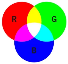
Each colour value ranges anywhere from 0-255. These numbers tell the screen or monitor how bright or dark the colours should be. Different combinations create different colour results.A bright yellow, as shown, has an RGB colour value of: Red- 255, Green- 255, and Blue- 0. Weirdly enough, if all the RGB values are at 255, or 100%, the result will appear as pure white. When all the pixels are turned off, or their value is 0, the result you see is black.
I mentioned that RGB uses pixels. This is a clear indication that the RGB colour model is used on interfaces such as computer screens, phones, and your television. Even photos taken on cameras automatically default to RGB. Pixels = technology. Now, there are occasions where a printer reads RGB colour, but this is very common for images printed directly from cameras.
Bright colours that you see on screens will never print as vibrant on materials such as Banner Stands or a Pop-Up Display. Why’s that? The specific printer and ink Exhibit Studio uses, responds to a colour model called CMYK.
WHAT ARE CMYK COLOURS?
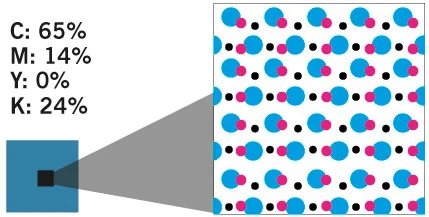
I use CMYK at home – what exactly is the difference? CMYK is a subtractive colour model that works by removing other colours to provide lighter tones. Each colour is put on the paper separately and in different layers using dots. This layering process is called Half-toning.
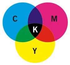
CMYK stands for Cyan, Magenta, Yellow and Black. These colours each have a value between 0-100. When all of these colours are mixed together, you see black. Simply: the more the colour = the darker the results. Think of it as mixing together different paints. When you mix all the colours together you end up with a really dark colour, typically close to a black or brown colour. The less colours you mix, the lighter the end result.
At Exhibit Studio, our print technician uses his best judgment to colour correct any design that was created in RGB to CMYK. We will run multiple test prints to ensure the colours you see on the screen match up as close as possible on your graphics.
So what are Pantone Colours?
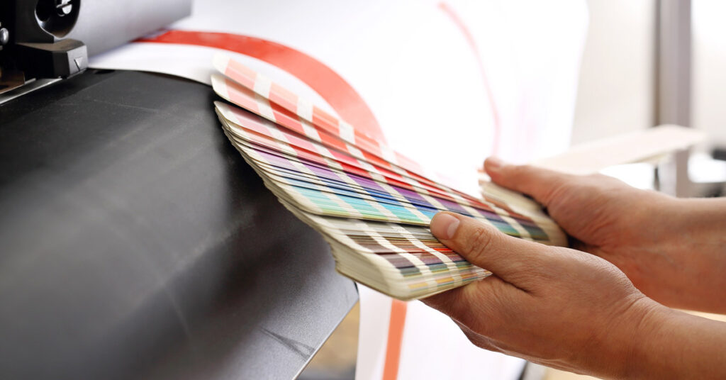
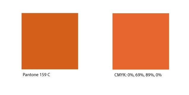
A Pantone is a solid colour, made up of a very specific number code that is matched all around the world. Pantones are so specific that they are typically used for logos or official documents. Pantones colours consist of different uses and materials. Their organized fan booklet (like that of a paint colour book) makes it easy for perfect colour matching. We LOVE Pantones! Sometimes however, technology doesn’t pick up that your supplied design file or logo contains a Pantone at all. If this is the case, CMYK interprets a slightly different value combination.
In the image beside, you’ll notice a slightly different interpretation of the two colour models and how they slightly differ in colour. It’s important to let us know that you have a Pantone so we can colour correct if needed.
In a large-scale design, colours that are slightly different from one another are that much more noticeable. Different lighting, transparencies, and sizing are all factors which may affect the way your trade show display looks in the end.
