Hear me out! No, InDesign doesn’t suck, but yes, it’s not the right program to use when designing a trade show display. I posted this article a couple of years ago on our old blog, and it was very popular — I thought it worth updating and posting again.
Why can’t I send you my design files in InDesign?
This is a question we regularly hear from designers working with us for the first time. They are often dismayed to find out that we do not print from native InDesign or from PDF files. These formats are so commonly used in small-format print projects that we are inevitably asked, why not? This question often leaves our sales staff tongue-tied, because there are multiple, layered reasons that include a lot of design jargon and require a pretty good understanding of how the Adobe Creative Suite works. So if you’re one of those asking, “why not,” allow me to provide a detailed answer!
REASON 1: SCALABILITY
InDesign is meant for laying out graphic elements in a multiple-page document at 100% size. If you’re working on a magazine spread with an 8.5 x 11” page, that’s the size your document it set at.
In large format design, working at 100% scale is not feasible. Some of the displays we sell are so large that they don’t even fit on an InDesign (or Illustrator) artboard at 100% size. So like every other large format producer, we work at a scaled-down size: 10%. If a pop-up display graphic area is 108” wide, we work at 10.8” wide. Easy. This scaled down format helps reduce file size for faster opening, editing and saving, as well as making it easier to prepare digital proofs for client review.
So why not work in InDesign at 10% size? If you’ve ever tried to scale a project in InDesign, you’ll understand the difficulty. Grouped objects and effects do not always scale with the rest of the design. Any page margins or guidelines need to be manually adjusted as they also do not scale with the design. Text doesn’t always scale as expected. As a print technician, it quickly becomes a nightmare to resize client-supplied artwork to the final print dimensions.
REASON 2: Layers
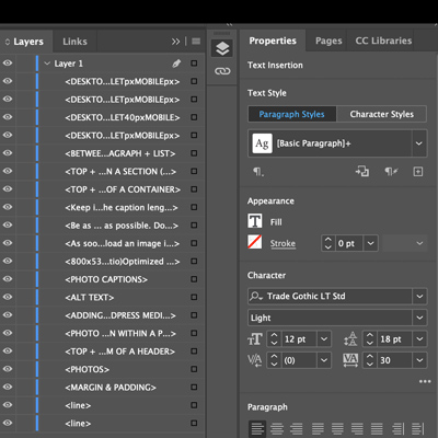
Another reason InDesign is less suitable for display design is the layering of objects. Layers and groups are crucial when working with a single display that may have anywhere from ten to a hundred different elements—text boxes, logos, images, graphics—all of which may also have different appearance filters applied.

If we encounter any alignment or appearance problems during the test printing stage, we need to be able to dive into a client’s design and determine where the problem is occurring and how to fix it. This is much easier when using layers and Illustrator’s nested grouping system.
And yes, I know there are layer options in InDesign. The reality is, 99% of the files we receive in InDesign have not included layers—and InDesign does not yet offer nested grouping.
REASON 3: TEMPLATES
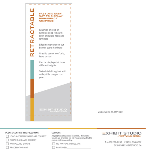
This point connects to both the scalability issue and the layering issue. We have designed artwork templates for each of the products we carry, and some combinations of these products as well—for example, a set of three Retractable banner stands is available as a single template, rather than three copies of a single Retractable template. Most of our templates include two very important layers: the Visible Area layer and the Bleed Area layer.
The Visible Area layer shows the user a preview of how the display will look installed in the hardware. This is more than just hiding the bleed area. Some areas of the finished, trimmed graphic will not be visible on the final product, such as the edges of a pop-up display that wrap around to the back. It’s extremely important that designers use this layer to preview what the finished product will look like. It’s like a TV safe area: if certain areas of the design are not always visible, you need to know where they are!

The Bleed Area layer shows all the printed sections of the graphic, the trim areas and any panel breaks. This layer is important for layout, but also very important for print. This layer scales up with the design during pre-press and stays intact during the print process, telling the print software where to place overlapping trim marks.
The problem with designing templates like this for InDesign are threefold: the Bleed Area layer doesn’t export for print, designers often overlook layers in InDesign and miss the importance of the Visible Area layer, and/or when we’re sent an InDesign .eps file all the layers have merged together, eliminating the very important Bleed Area layer or merging the bleed lines and hardware preview with the actual design.
REASON 4: PRINTING
Everything I’ve discussed up to this point are issues related to creating and working within an InDesign document. However, even with a simple project that is properly scaled to 100% size, with all effects appearing correctly, we still have a very pressing issue: Printing.
As with most large format printers, our print and software combination prints directly from only .TIF or .EPS format, with .EPS being the preferred method to print when there is text included in the design. Somewhere between CS3 and CS4 InDesign dropped the ability to export .TIF files. And while we can still export .EPS files from the program, we encounter export errors at least 50% of the time. We often see effects, such as drop shadows, disappear and text convert to outlines or change typefaces.

Images are often split into several different clipping masks, making it impossible for us to colour-correct them in the print software. If these errors are not caught at the test print stage we’ll usually notice them once we print the full-size display— and then waste yards of material and hours of our time fixing and reprinting. These inefficiencies make us very reluctant to work with InDesign-generated .EPS files!
Illustrator generates flawless .EPS files almost every time. Photoshop produces perfect .TIF files. When we work with files where the images have been edited in Photoshop and placed into a layered Illustrator file (and on one of our templates!) the printing process runs smoothly—from prepping files, to test printing, to laminating and trimming the final display.
Just to clarify—I love InDesign! I still use it regularly for brochure and ad design and a myriad of other small design projects that come my way. It’s a great program. It simply isn’t the right program for trade show display design. Our display templates have been painstakingly perfected in Illustrator to make it as easy and clear as possible to lay out a beautiful display design and preview your final display.
