I know I’m a little late to the 2021 trend party, but I would like to share a few of the graphic design trends I’ve taken notice of and enjoyed so far this year. Our visual culture is shaped by the things happening around us. Styles shift and change with us as our societies shift and change in tandem. Things repeat themselves and return to fashion, just like those high-waisted jeans that have come back with a flourish.
Lots of people don’t notice design or the fact that it surrounds them almost constantly. I didn’t pay attention to it all that much myself before I went to school. But once you see it, you can’t unsee it. Design is EVERYWHERE! Every shoe you put on or chair you sit in. Every road you drive down or bus you take. Every icon you click on your phone. It’s all been designed. Design aims to serve a function and graphic design, in particular, communicates. That’s its intention. Writing covers communication too, but graphic design uses both imagery and typography to deliver a specific message. There is a hierarchy between different elements developed within a set amount of space so that whoever is reading it also understands it. Captivated by the image and informed by the writing.
I know I’m a little late to the 2021 trend party, but I would like to share a few of the graphic design trends I’ve taken notice of and enjoyed so far this year. Our visual culture is shaped by the things happening around us. Styles shift and change with us as our societies shift and change in tandem. Things repeat themselves and return to fashion, just like those high-waisted jeans that have come back with a flourish.
So without further ado, here are my five favourite graphic design trends so far this year. I’m obviously not predicting at this point, just noticing and appreciating.
NATURE
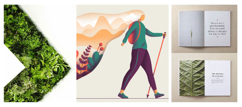
This one has been on the rise for quite some time now. The use of design elements that emanate the feeling of being outside. Greens, blues, browns, and textures too! When all you can do is stay inside and isolate yourself, you might feel the sudden need for a change of scenery. People who have had no interest in the great outdoors all of a sudden can’t be held back and need to go for a picnic or hike. This pull toward a natural environment has inspired many designers to use natural colour palettes and try to replicate the calm feeling that the outdoors do. We’re also living in a time when people pay close attention to how we care for our planet. A little ode to planet earth in our visuals is a beautiful way of showing appreciation and support for such things. A client of ours, Spiritleaf has branding that is on point and on trend at the moment. Their website here.
MUTED COLOUR PALETTES
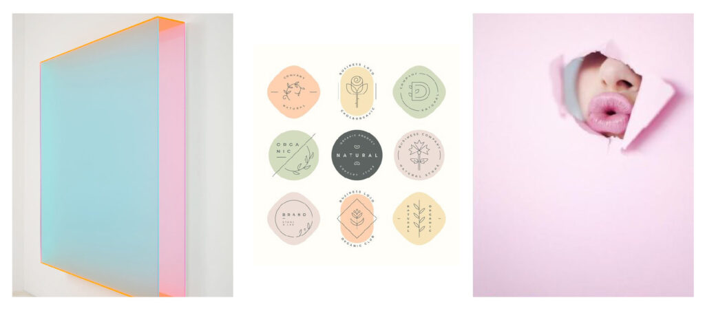
Let’s all take the proverbial chill pill. By adding black or white to a bright colour, you can bring its intensity down and present a more calming aesthetic. Bright colours are full of energy, and I think the mood this year will influence an attempt to lower the fierceness of what we see every day, hoping that we can all relax a little bit.
FLAT ICONS
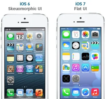
There was a time – probably just the last IOS update – that most icons used were three-dimensional looking. Now the flat icons are back, and they seem to be everywhere. They’re easy to interpret, enjoyable to look at and communicate just enough. If you add a slight drop shadow to one of these pretty’s, they tend to jump off the page at you creating depth despite their inherent flatness.
OPTICAL ILLUSIONS
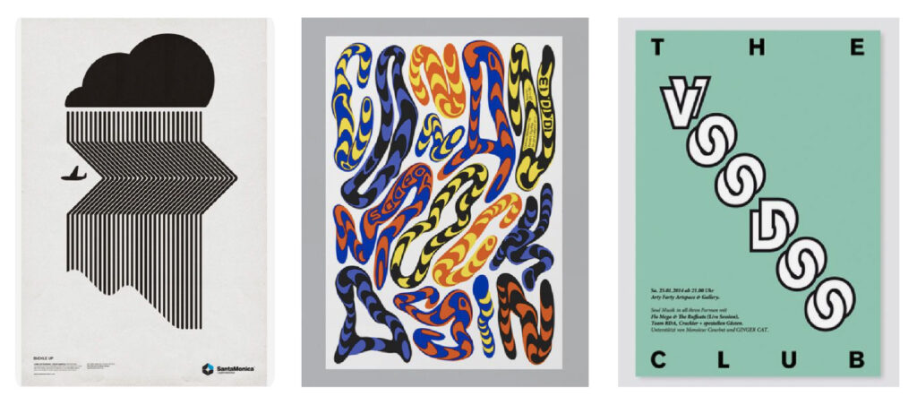
Sifting through an optical illusion to make sense of it takes time. It makes the viewer stop and attempt to interpret what is happening. The time the viewer will spend with this type of design will have them sit on your page for longer and may help to kill your bounce rate. Or, at the very least, time spent on your page will be more than 0.02 seconds. These things are visually stunning to look at and just plain fun, in my opinion. Here’s a neat little holographic illusion from one of our clients for you to check out.
GEOMETRIC SHAPES
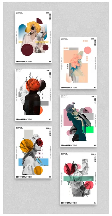
A classic staple that keeps coming back again and again. These seemingly simple shapes are a graphic designer’s dream. They cut up space within your design and effectively create visual hierarchy all on their own. Add other visuals and text elements to your page after that, and you’re off and running, my friend.
There are many ways that graphic design can help deliver a vmessage. Hopefully, some of these trends will help inspire you to put something out there, whether for yourself, for your business, or just for fun. Happy creating, everyone!
