breaking down colour models: RGB, CMYK, and Pantones
introduction
When preparing artwork for print, colour accuracy is key to achieving the polished, professional look your brand deserves. One thing we see often is artwork built in RGB — a colour model designed for screens. While it’s great for digital design, it doesn’t always translate the way you expect in large-format print.
To get bold, consistent results on banner stands, backdrops, and exhibit graphics, it’s best to create your files in CMYK, the colour model used by printers. In this post, we’ll walk through the differences between RGB and CMYK and explain how starting with the right setup helps ensure your display looks its best.
RGB colour model: best for screens, not print
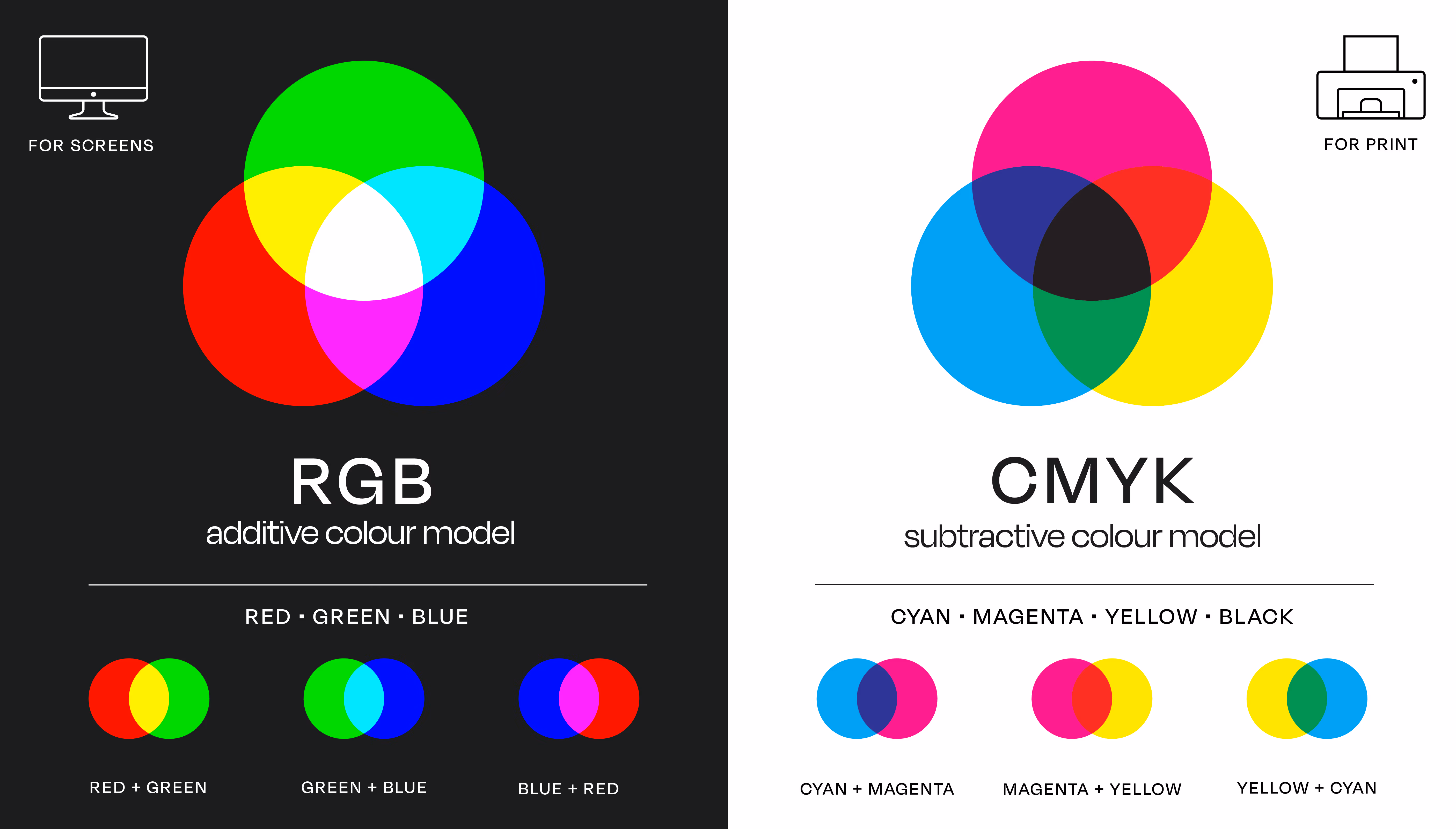
RGB (Red, Green, Blue) is an additive colour model used to display images on electronic screens. RGB colours are created by mixing varying intensities of light, with values ranging from 0 to 255. The result is a wide colour gamut, capable of producing bright, saturated tones — especially on high-resolution screens.
CMYK colour model: the standard for print
CMYK (Cyan, Magenta, Yellow, Black) is the subtractive colour model used in all professional printing. Instead of mixing light, CMYK layering subtracts brightness from a white background by applying ink in fine dots (a process known as halftoning). The more ink applied, the darker the resulting colour.
CMYK is the standard across all types of large-format print because it offers greater control and predictability when producing physical materials. Exhibit graphics created in CMYK are more likely to match branding expectations, especially under variable lighting.
However, this brightness doesn’t translate to physical materials. Displays printed with RGB files often appear dull, muted, or inaccurate compared to how they look on screen. That’s because large-format printers are not designed to interpret RGB with the same precision as CMYK.
what happens if an artwork file is submitted in RGB for print?
When a file is submitted in RGB, it must be manually converted to CMYK before printing. This often leads to unintended colour shifts, especially in vibrant tones like neon blues, lime greens, and hot pinks. Exhibit Studio’s print team reviews and adjusts these files as needed — sometimes running multiple test prints to ensure the final output meets expectations.
While minor adjustments can be made, RGB-based artwork can slow down production timelines, introduce uncertainty, and result in colours that don’t match brand standards.
what are Pantone colours?
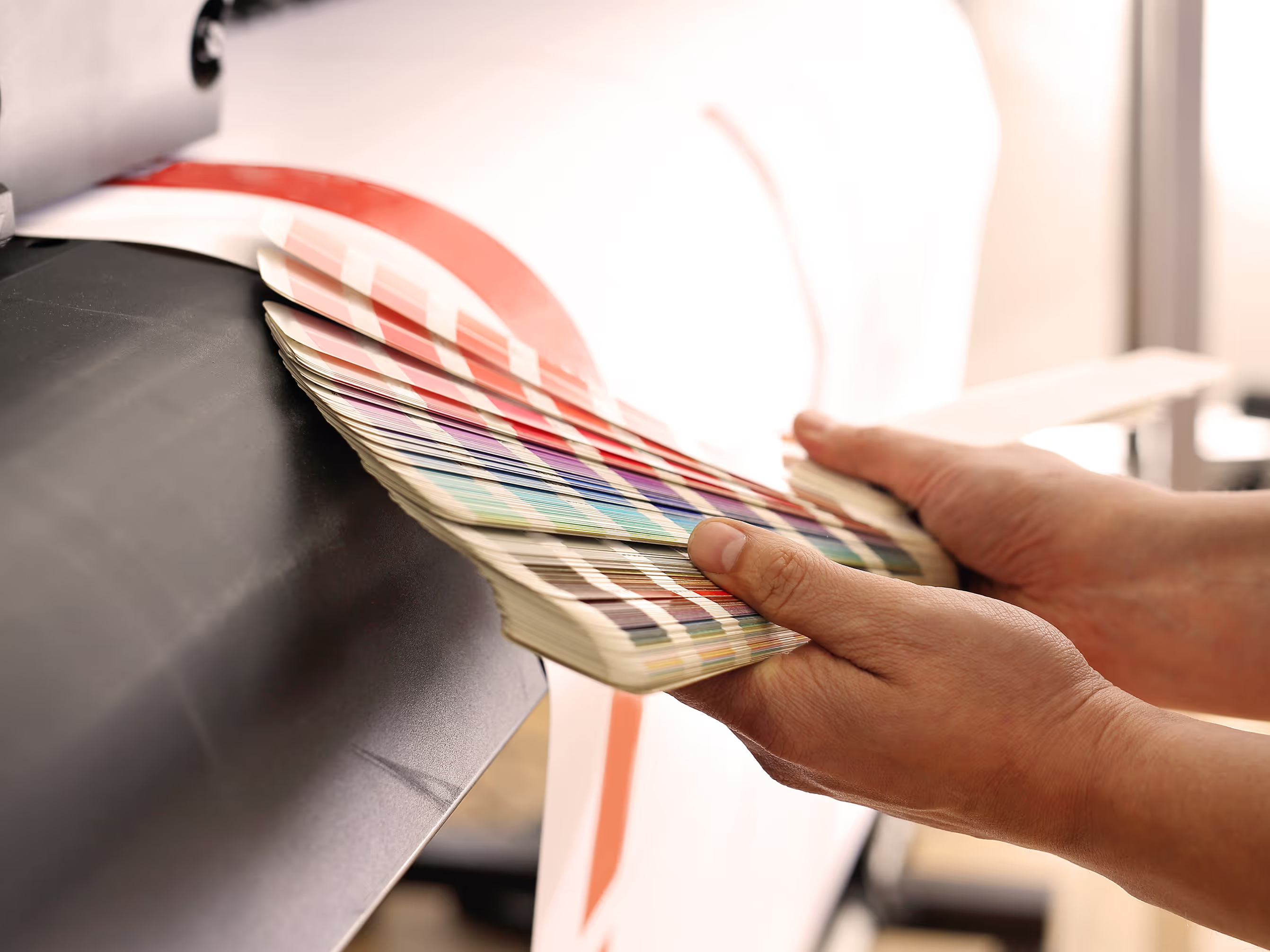
Pantone Matching System (PMS) colours are standardized spot colours used globally to ensure consistency in brand applications. A Pantone colour is formulated with exact pigment values and can be matched with exceptional accuracy — if the printer knows it's there.
Pantone colours must be identified early in the design and production process. If they’re not embedded correctly or get converted to CMYK during file export, the final colour can shift noticeably. When preparing artwork for trade show displays, it’s best to specify Pantone colours clearly and ensure they’re maintained in the design file.
why file setup matters in large-format printing
In large-format applications, colour consistency becomes more noticeable, especially across multiple panels or hardware systems. Minor discrepancies in colour can appear exaggerated when viewed across several feet of printed material.
Factors that amplify inconsistencies include:
- Material differences (example: vinyl vs. fabric)
- Venue lighting
- Transparency or gradient effects
- Use of non-vector logos or inconsistent colour builds
To avoid these challenges, all of your graphics should be designed using CMYK colour values and formatted according to the proper product templates.
best practices for artwork file setup:
- Set up your design files in CMYK right from the start: avoid RGB for any print-based project.
- Use Adobe Illustrator or Photoshop: these programs host CMYK colour spaces. Just don't use InDesign for exhibit graphics.
- Embed Pantone values properly: notify the production team you're working with if your branding depends on specific spot colours.
- Use the provided product templates: use proper bleed, sizing, and scaling specified for your project.
our approach to colour accuracy
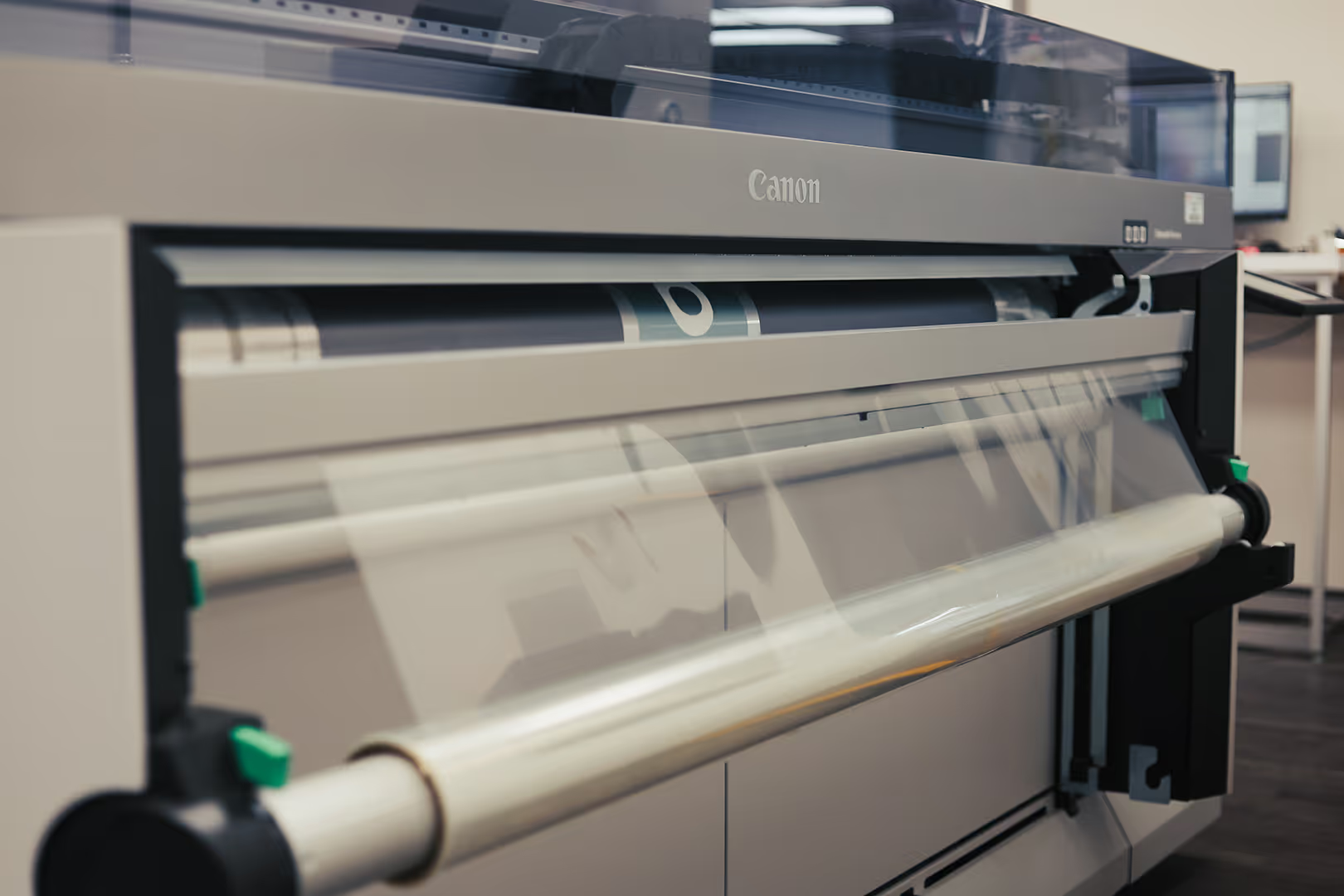
Our in-house print team uses professional RIP software and colour calibration processes to ensure consistent, high-quality output across every project. In-house test printing is used to review files, identify potential issues, and make necessary colour corrections before final production.
Design templates are provided for each display type to simplify the design process. These templates are set up with correct dimensions, bleeds, safe areas, and CMYK formatting to ensure smooth production from design to installation.
final thoughts
Understanding how RGB, CMYK, and Pantone colours work is the key to getting accurate, consistent results with your graphics. Choosing the right model from the start ensures your graphics colours appear clean and accurate.
Sign up for more insights like this!
Let’s talk ideas